As you head into the weekend, here is a little piece of inspiration that should make you smile and admire the creativity behind it.
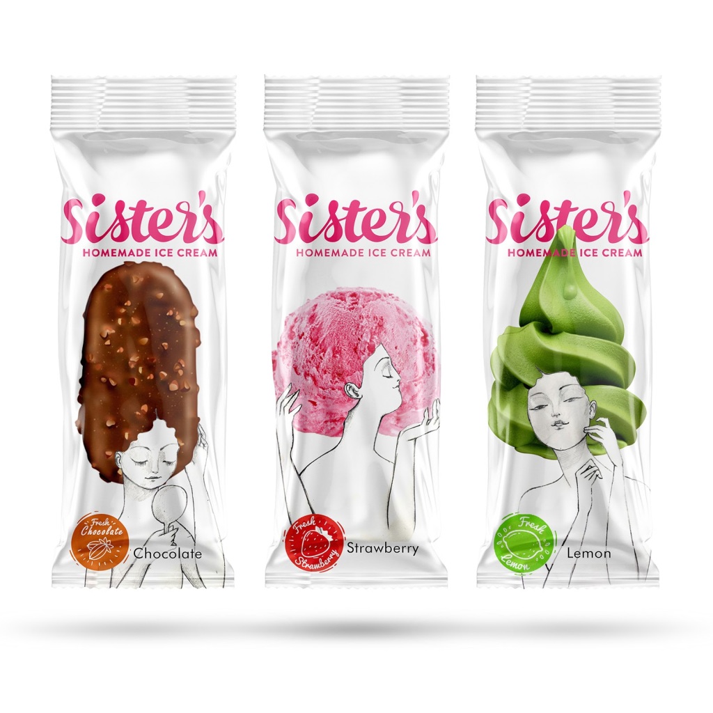
Sister’s is a homemade ice cream from Iran, made by three sisters. The packaging design has been done in a way to represent the identities of the manufacturers, clearly mentioning that it is homemade ice cream.
It has also been designed to ensure that the packs stand out in comparison to other big and small players in the market.
The spark of colour, representing the flavours on a nice and soothing white background stands out and gives it a fresh, cool and summery look. The smart use of the illustration to show the different hair style brings the fun element.
I am not sure how big the #brand is, how strong its distribution is and whether this concept has been scaled up or not. I do hope that this #packaging is helping the brand win the consumers’ hearts and share of wallet!

![]()
